When people say they do not want a rebrand, the logo is rarely the whole argument. They may be protecting a decision they made, a history they helped build, inventory that still has to sell, or a business that appears to be working. If I treat that resistance as bad taste, I have already misunderstood the assignment.
A rebrand is a change-management problem before it is a design problem. The creative work matters, but the first job is to understand what people believe they could lose. Then I can build enough evidence for them to judge a new direction without feeling that I am erasing the old one.
Resistance is information
I have made hundreds of logos over more than twenty-five years in branding and marketing. Older companies are not necessarily harder to design for, but they do carry more accumulated meaning. A founder may see the first office, the first customer or a difficult period the company survived when looking at a mark that everyone else sees as dated. Operations may see the cost of changing packaging, signage, web assets and product tooling. Sales may fear that customers will not recognize the new identity. Legal teams may see trademark work.
Those are different problems. They should not be collapsed into “the client is afraid of change.” Before drawing, I try to name the resistance: emotional continuity, commercial recognition, implementation cost, internal politics, or uncertainty about what the new identity would improve. A useful rebrand brief needs a response to each one.
The CyberPowerPC rebrand began with patience
When I began working with CyberPowerPC in 2015, the company had used its original C-and-P identity for roughly fifteen years. The CEO and the people around him were proud of it. I arrived eager to modernize the brand, but an immediate presentation asking everyone to reject something familiar would have turned the design into a referendum on their judgment.
Instead, I let the work become familiar before asking for a decision. I explored the competitive landscape, developed alternatives and kept the conversation visible over time. The point was not to trick anyone into approving a logo. It was to move the discussion away from a split-second reaction and toward a repeated, applied comparison. Familiarity gave the team enough time to separate “this is new” from “this is wrong.”
Use comparison to diagnose, not to manufacture a verdict
A competitive logo matrix helped me show the category as a system. I placed marks together so we could compare silhouette, legibility, density, proportion, product fit and distinctiveness. Our old logo looked loose beside marks designed to live confidently on hardware. The new direction had an enclosure, a stronger center and a shape that could become a badge.
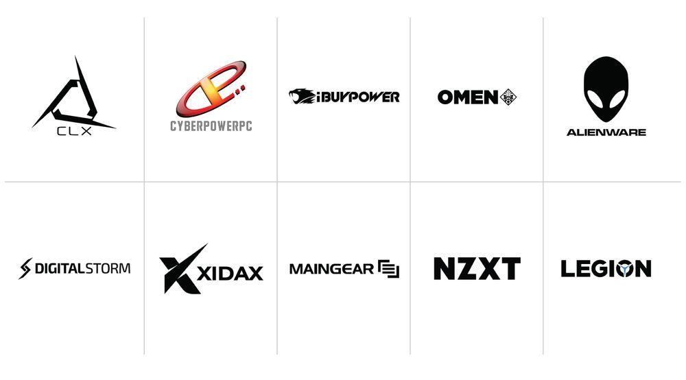
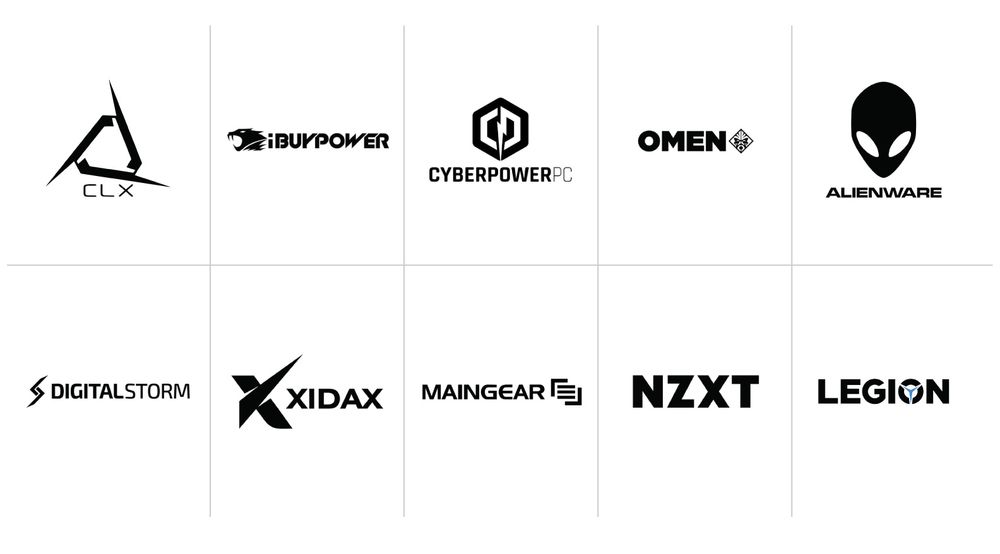
In the original process, I also experimented with hierarchy: the old mark sat among weaker category examples while the strongest candidate appeared closer to the brands the company aspired to compete with. That presentation helped management imagine a different future. Looking back, the durable lesson is not to stage a predetermined answer. It is to define the comparison criteria openly. If a matrix cannot survive neutral ordering and direct questions, it is persuasion theater rather than research.
A current identity review should also include clearance work. Visual comparison is not a trademark search, and resemblance can create problems long after a design is approved. In the United States, the USPTO trademark search guidance and database are a starting point; international teams can also consult the WIPO Global Brand Database. Counsel should review the jurisdictions and classes that matter before a rollout.
The mark emerged through exploration
The final CyberPowerPC icon was a large departure from the original floating C and P. I tested squares, rectangles, rhombuses, octagons, hexagons and other proportions. The hexagon simply clicked. It created the enclosure the old mark lacked and gave the identity the permanence of a stamp.
I did not begin with a lightning bolt and force the initials around it. The bolt emerged late. The P occupied too much visual space, so I thinned the lower area to balance it against the C. As I refined that negative space, the bolt became a logical result. The C and P remained subtle—recognizable to someone who knew the brand, but not so literal that the icon became a monogram puzzle. From a distance, it could simply read as a hexagonal badge with energy at its center.
A logo becomes credible in application
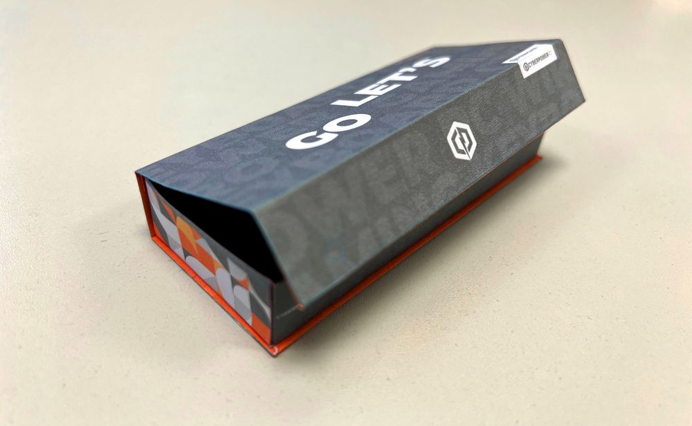
Once a few directions became viable, I stopped presenting them as isolated vector art. I mocked them up on business cards, product badges, packaging and web interfaces. For packaging, a printed dieline that can be cut and folded teaches more than a flat screen: scale changes, folds interrupt graphics, shelf angles hide information and ink behaves differently on material than it does on a monitor.
The identity also expanded into a geometric pattern. At the time, most case ventilation defaulted to anonymous hexagonal holes. I saw that ordinary functional surface as an opportunity for branding. I provided the pattern on two-dimensional case drawings, worked with manufacturers to test airflow and manufacturability, then reviewed physical samples. Metal stamping distorted the pattern around sharper angles, so we adjusted scale, position and alignment until the deformation was no longer visually distracting.
Packaging and the first patterned case arrived together. An orange-to-magenta side panel carried the motif in a lighter, diffused form, creating a recognizable retail edge even when most of the box faced away. The same system later reached layered, debossed business cards. None of those applications were decoration after the fact. They proved that the identity could organize an experience from ventilation holes to paper stock.
Give the decision a sequence
| Gate | Question | Evidence |
|---|---|---|
| Reason | What business or experience problem are we solving? | Stakeholder interviews, customer signals, implementation constraints |
| Category | How must the brand fit—and where should it differ? | Neutral competitive matrix and use-case criteria |
| Form | Does the identity work without effects or color? | Black-and-white silhouettes, small sizes, inverse versions |
| Application | Can it survive real production? | Packaging folds, product badges, materials, prototypes and accessibility checks |
| Rollout | Can the organization replace the system coherently? | Asset inventory, owners, cost, timing, legal review and transition rules |
| Recognition | Are people connecting the new signals to the same promise? | Support feedback, retail observation, search behavior and unaided recognition |
This sequence reduces the temptation to ask, “Which logo do you like?” too early. Preference is useful, but it is not a rollout plan. A decision-maker should be able to explain what the mark needs to do, where it will fail, what it costs to implement and why the selected direction is stronger under the agreed criteria.
Consistency is partly an operations problem
Orange was closely associated with CyberPowerPC, largely because the CEO loved it. But orange cannot solve every contrast problem, and a brand becomes fragile if recognition depends on one color. On an orange-heavy graphic, an orange logo disappears. I gradually made black and white the default so the shape and name could carry recognition by themselves.
I never controlled every use. Old orange artwork continued to appear. My practical response was to reduce choice: when people requested a logo, I sent the preferred black-and-white assets. I corrected files where I could and allowed consistent repetition to establish the new standard. Governance often works this way. The easiest approved asset eventually becomes the asset everyone uses.
The real milestone happened outside the presentation room
About five or six years into developing the brand, strangers began recognizing CyberPowerPC shirts I wore to restaurants or while picking up food. Some shirts carried the name; others used only the icon. People would tell me they owned one of the computers and loved it.
CyberPowerPC clothing was not ubiquitous fashion. It was mostly worn by employees or committed fans who received it at a show. That made the encounters meaningful. People not only recognized the identity; they felt enough ownership to introduce themselves through it. The mark had become a club signal.
Do not win the logo argument. Build confidence in the change.
The best rebrand process does not humiliate the old identity or corner its stewards into agreement. It turns resistance into requirements, gives unfamiliar work time to become legible, tests the system in real materials and creates a rollout the organization can actually maintain.
Design still needs a moment when something clicks. But approval becomes much more durable when that moment is supported by evidence: the mark holds together in black and white, fits the product, survives manufacturing, distinguishes the company and eventually becomes something customers recognize as theirs.
