I was nearing the end of a book manuscript when I began to feel a structural problem I could not yet name. The individual stories worked, but the transitions between narratives, case studies and ideas did not have the ease I admired in writers such as Malcolm Gladwell.
I did not want an AI system to imitate his voice or write the book for me. I wanted to use analysis and visualization to make an invisible editorial quality visible: how a nonfiction chapter moves the reader from story to concept and back again.
The question behind the experiment
In 2023, I used the introduction and first chapter of The Tipping Point as a small sample. Those pages introduce the book’s argument through stories about Hush Puppies, crime and social contagion before moving toward a broader theory. I was less interested in judging the argument than in seeing its sequence.
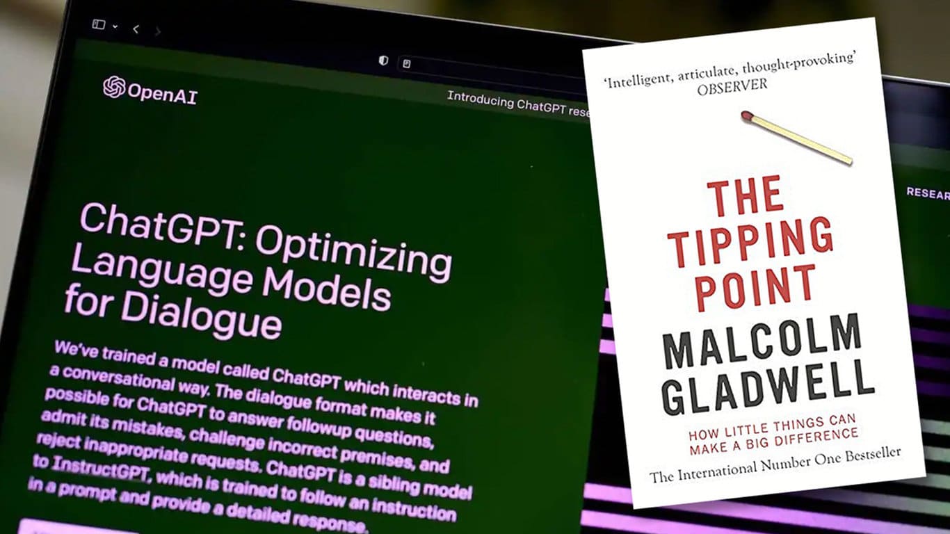
The experiment asked three practical questions:
- When does the text introduce a story, a concept or an explanation?
- How much space does each topic receive?
- Where does the narrative return to an earlier idea?
AI supplied a first pass, not a verdict
I asked ChatGPT to identify each distinct topic in order and estimate its word count. The prompt was intentionally mechanical:
2023 prompt: Identify each unique case study or topic, estimate the number of words devoted to it, and preserve the order in which it occurs. The goal is to build a framework for visualizing the organization of a narrative.
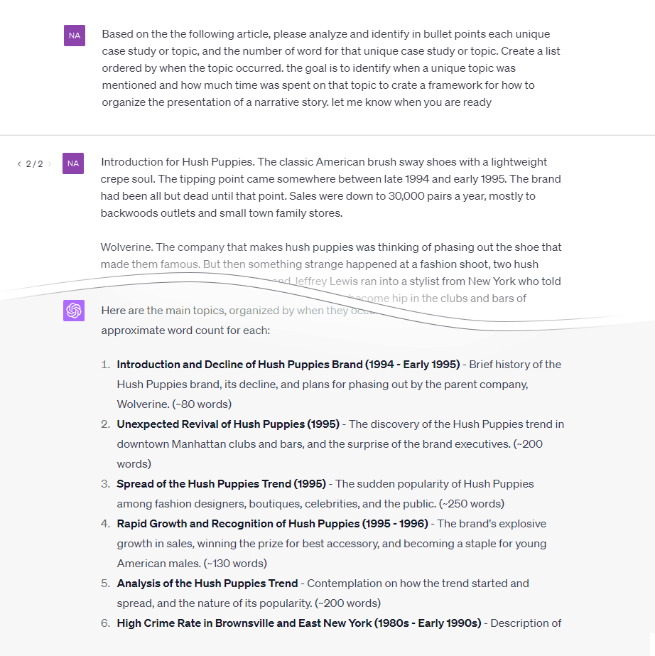
The output was useful but not precise. Transitional paragraphs often performed more than one job: they could close one story, introduce the book’s central question and foreshadow the next case at the same time. A language model can assign a label, but that label is still an interpretation. I treated the result as a starting hypothesis and manually corrected the sequence.
Turning topic labels into a visual system
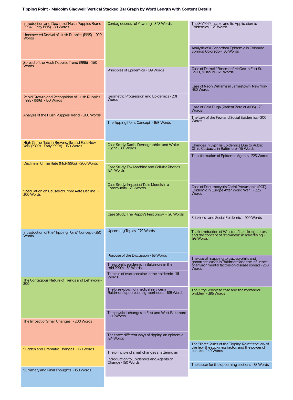
I grouped the draft labels into a small family of recurring subjects, then assigned each family a color. Related variations used neighboring shades. That choice made recurrence visible without pretending that every passage belonged to one perfectly clean category.
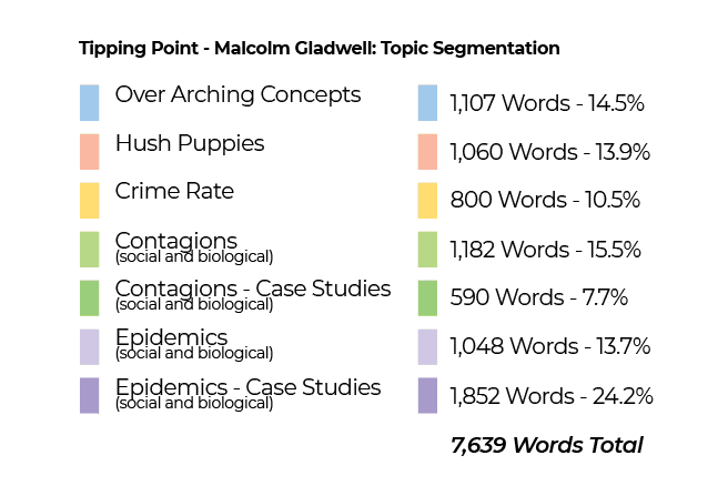
The first visualization stacked the passages vertically. Segment height represented approximate word count, so the page became a timeline of attention. It preserved the descriptive labels, but it was too tall to understand at a glance.
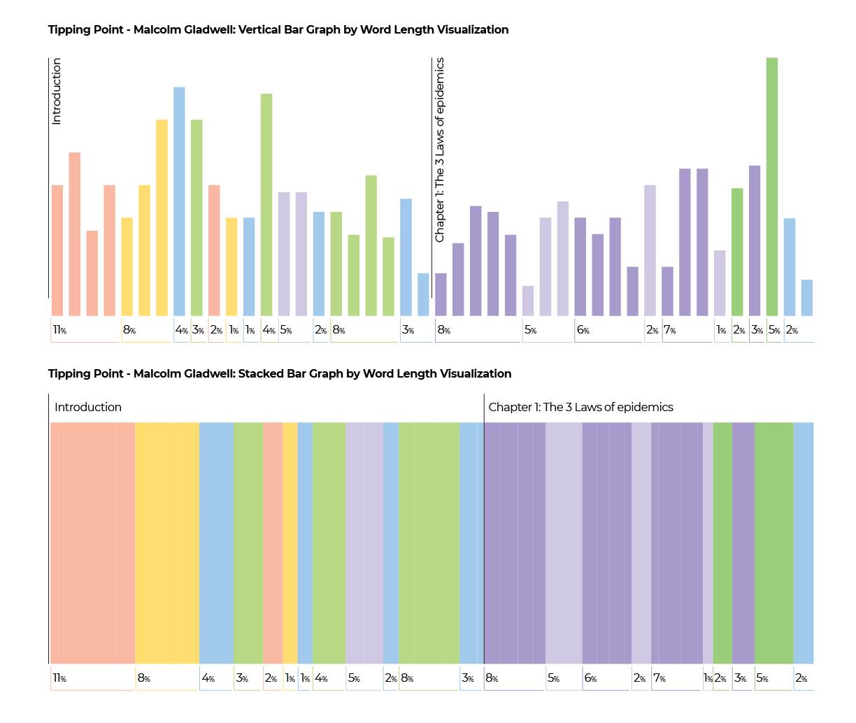
I then compressed the same sequence horizontally. Removing most of the annotation made the rhythm clearer: short narrative introductions, larger explanatory passages, returns to earlier cases and periodic reconnection to the central idea.
What the map revealed
| Structural move | What it does for the reader | What appeared in the map |
|---|---|---|
| Begin with a concrete case | Creates curiosity before asking the reader to absorb a theory | A distinct story block opens the sequence |
| Show the outcome before the mechanism | Creates an unanswered question | The story pauses before the larger explanation |
| Name the connecting idea | Turns separate anecdotes into evidence for one inquiry | Related colors begin to recur |
| Alternate story and explanation | Gives abstraction a human scale | Case-study and concept blocks interleave |
| Return to the central question | Reminds the reader why each detour matters | Earlier topic colors reappear near transitions |
The most useful lesson was not a formula to copy. It was a way to see narrative load. Gladwell’s sample did not move in a straight line from example to explanation. It opened loops, changed scale and returned to earlier material. The recurrence created coherence; the change in scale created motion.
What the visualization cannot prove
This is one reader’s analysis of a limited sample from one book. It is not a statistical model of Malcolm Gladwell’s complete body of work, and it does not establish a universal “Gladwell writing style.” Word count can show where space is allocated, but it cannot measure voice, sentence-level tension, research quality or the emotional effect of a story.
The AI step also does not remove editorial judgment. Topic boundaries should be checked by a human, ideally by a second reader as well. A useful visualization makes an interpretation inspectable; it does not make the interpretation objective.
A safer way to repeat the exercise
If I repeated the experiment now, I would use my own manuscript, public-domain text, licensed material or notes made during close reading rather than uploading a full copyrighted chapter. I would also check the service’s current data controls before submitting unpublished or sensitive writing.
- Choose a narrow question, such as pacing, topic recurrence or the balance between story and explanation.
- Define a small set of labels before analyzing the complete sample.
- Let AI propose boundaries, then check every boundary manually.
- Visualize both sequence and relative length.
- Use the map to ask editorial questions, not to imitate another writer’s voice.
The real value was seeing my own manuscript differently
The exercise gave me a practical diagnostic for my book. I could map a chapter, step back and ask whether a long conceptual passage needed a human story, whether an anecdote connected to the central idea, or whether I had closed the question too early.
That is where AI and visualization were most valuable. They did not supply the magic. They gave me enough distance to see the structure I had written—and enough clarity to revise it myself.